Homa Academy

How to Create a Mobile Game Colour Palette

MISSING ALT TEXT
Published:14 Mar 2023Author:HomaRead Time:6 min read
Share:

Creating the perfect hypercasual game colour palette is an essential yet often tricky part of the game creation process.

Get it right and you can create a visual experience that will delight your players. Get it wrong and at worst you can potentially confuse your players and have them bail fast.

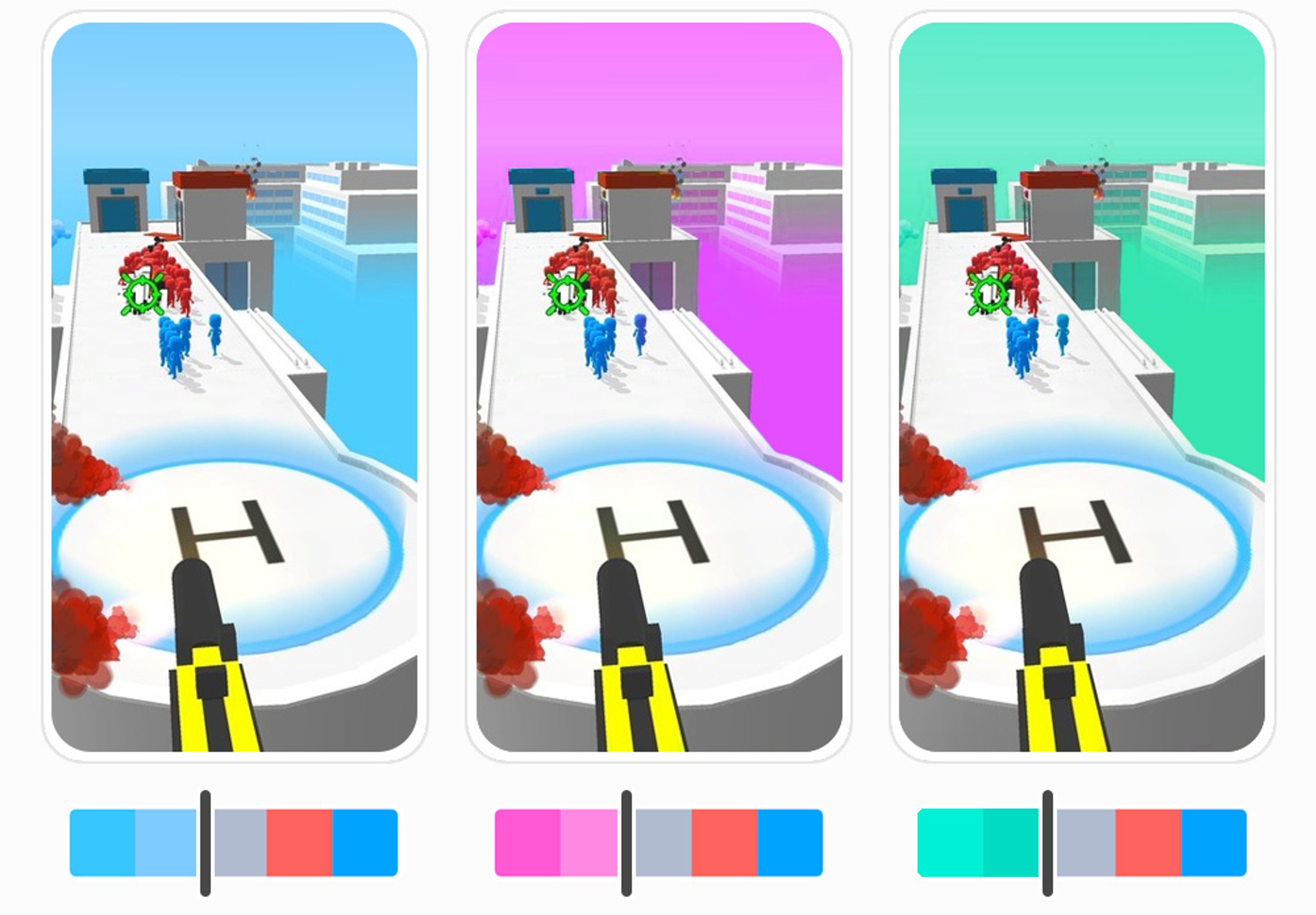
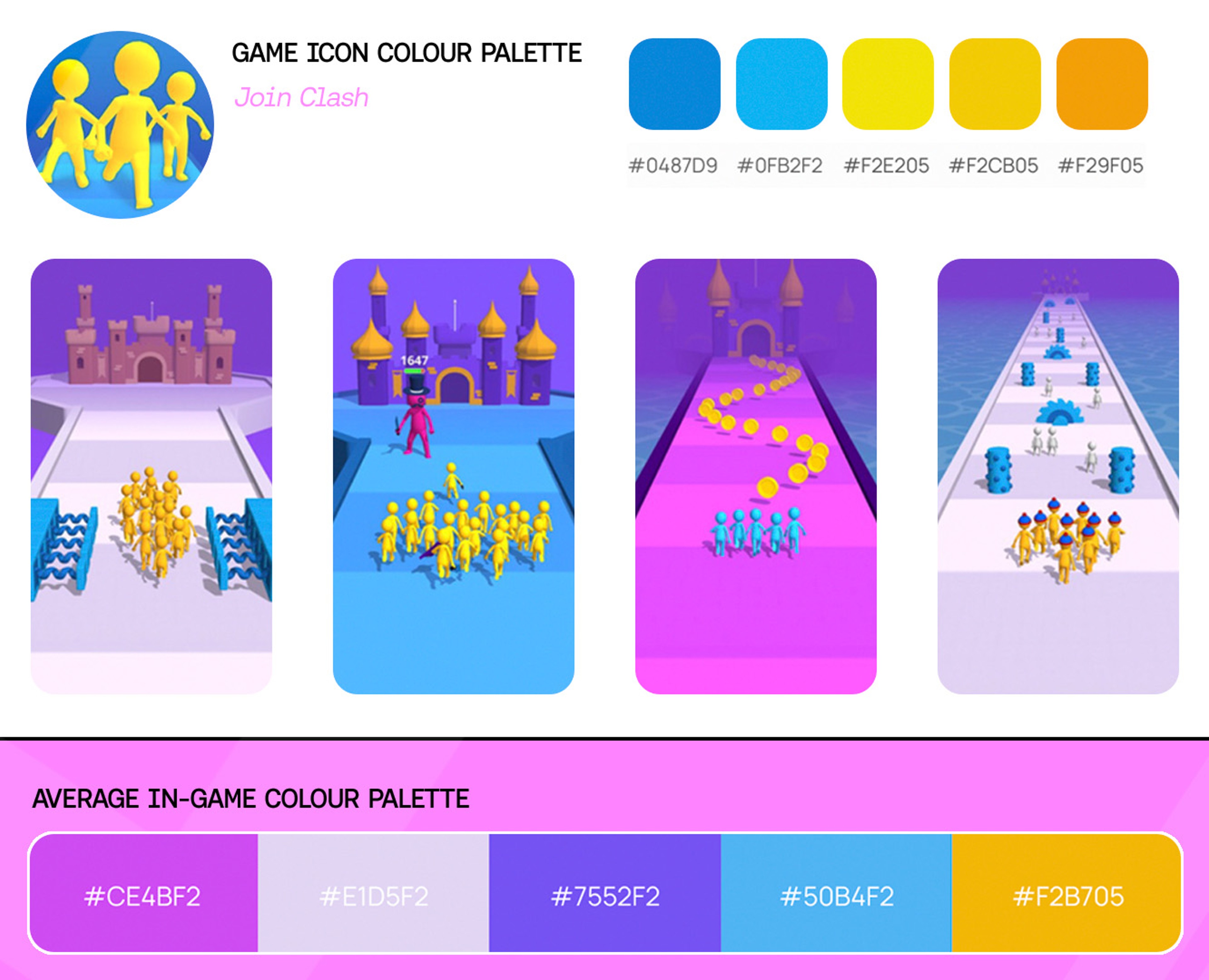
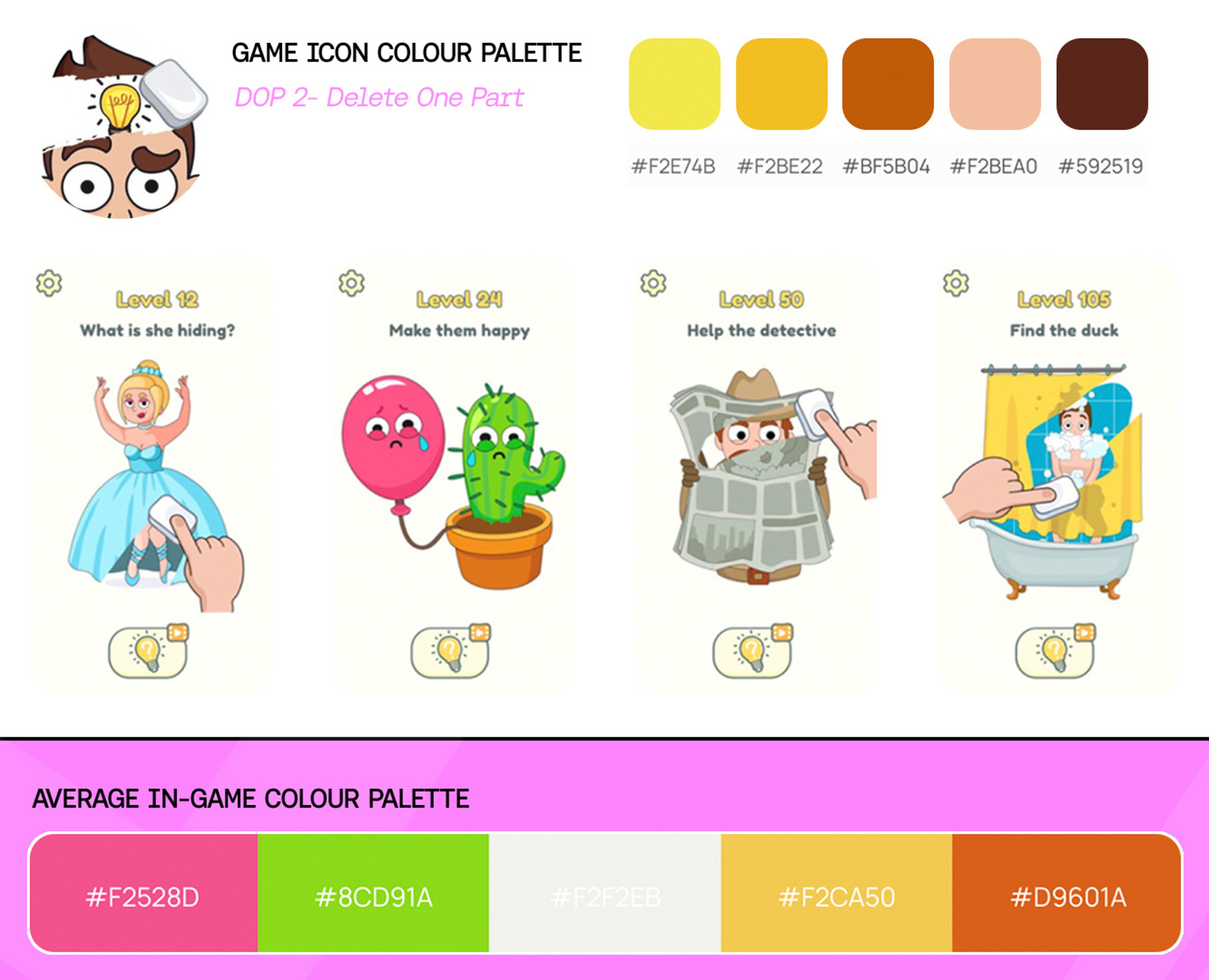
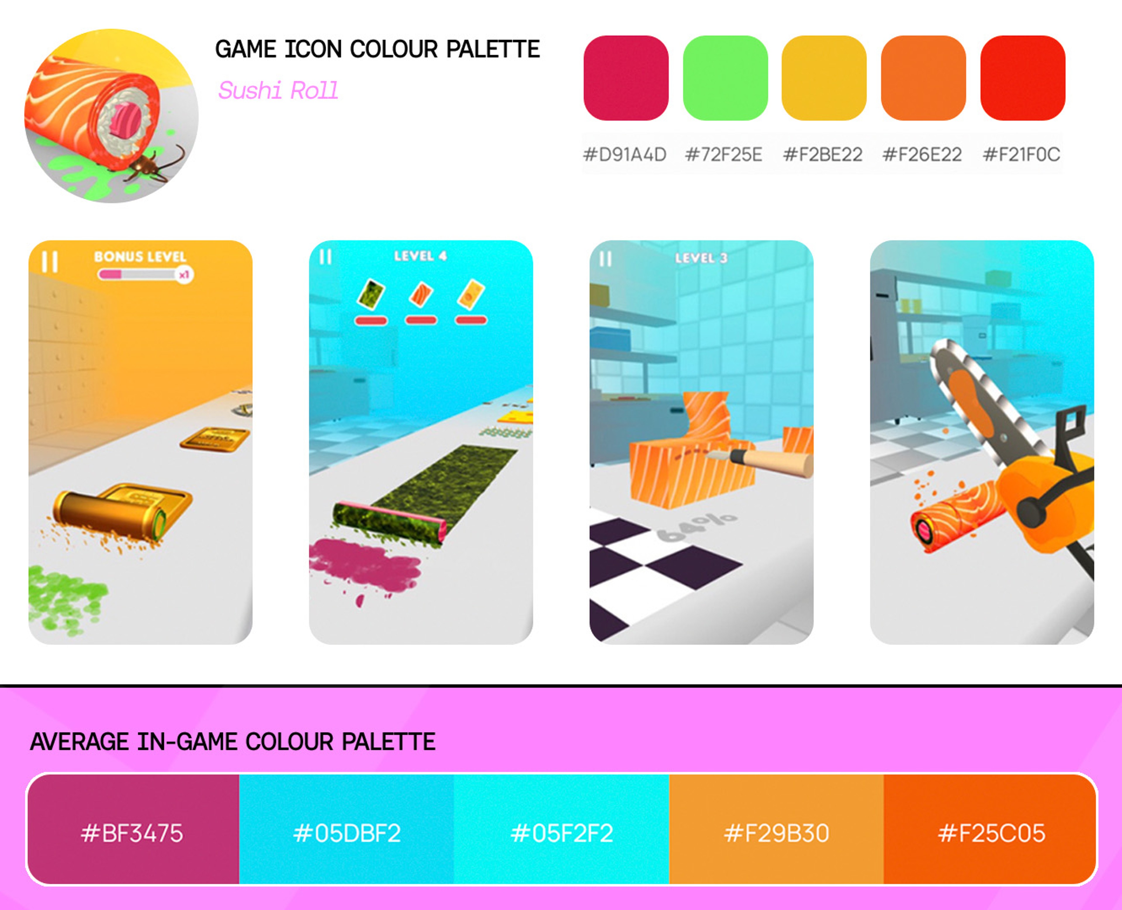
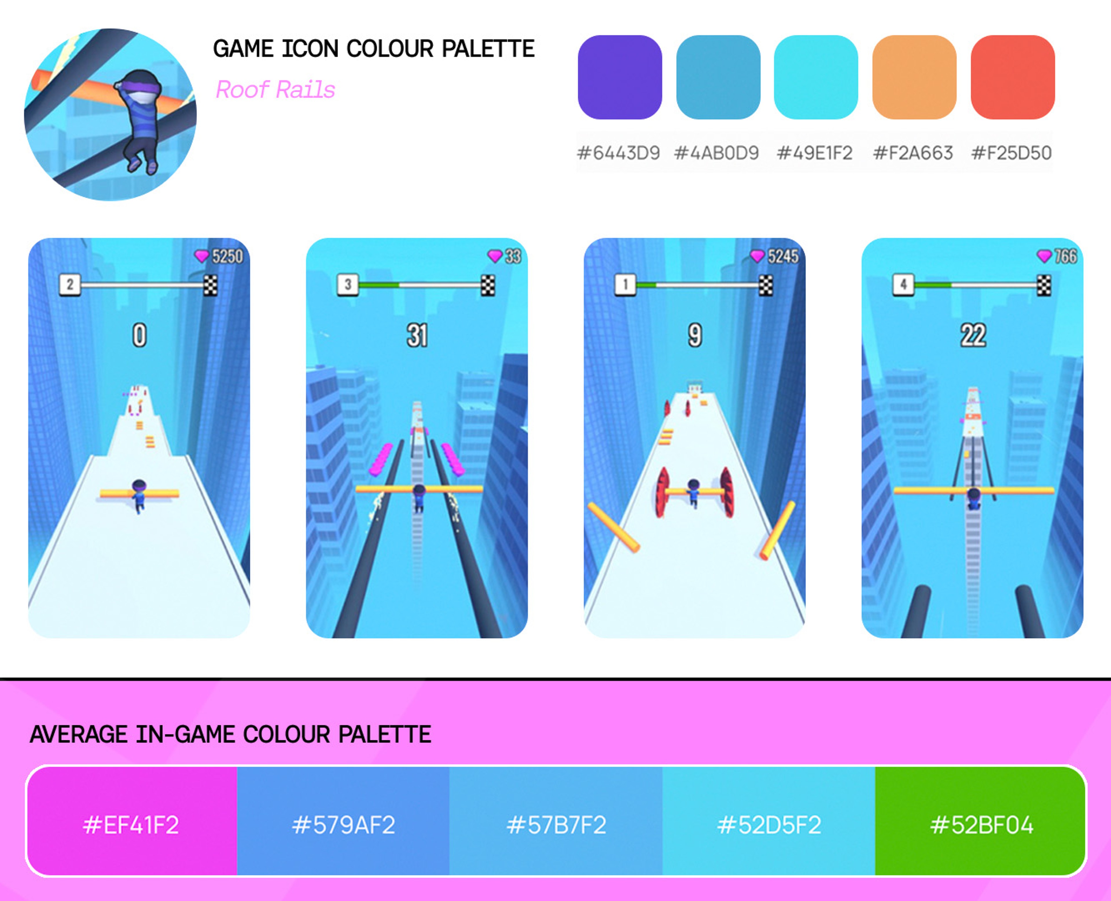
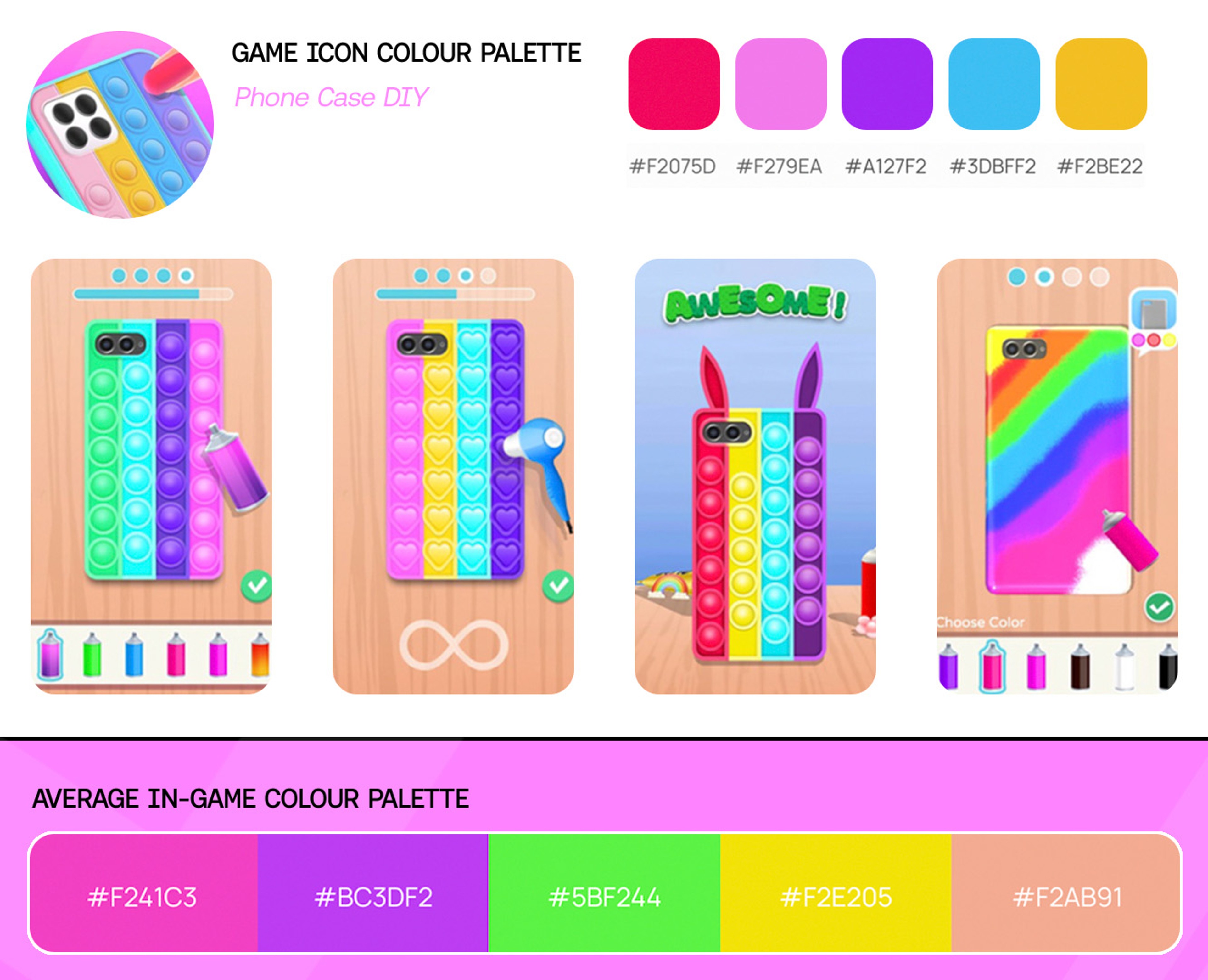
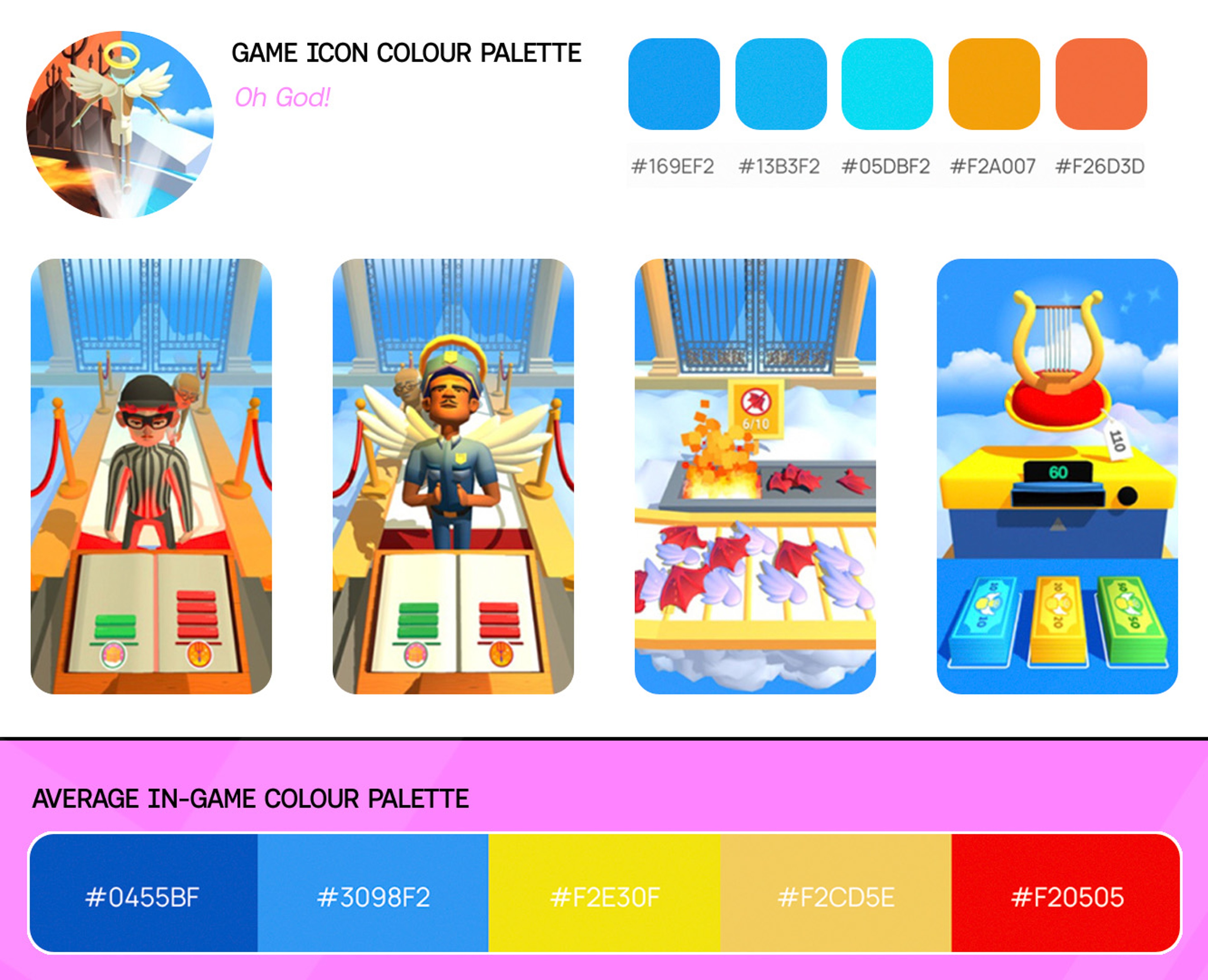
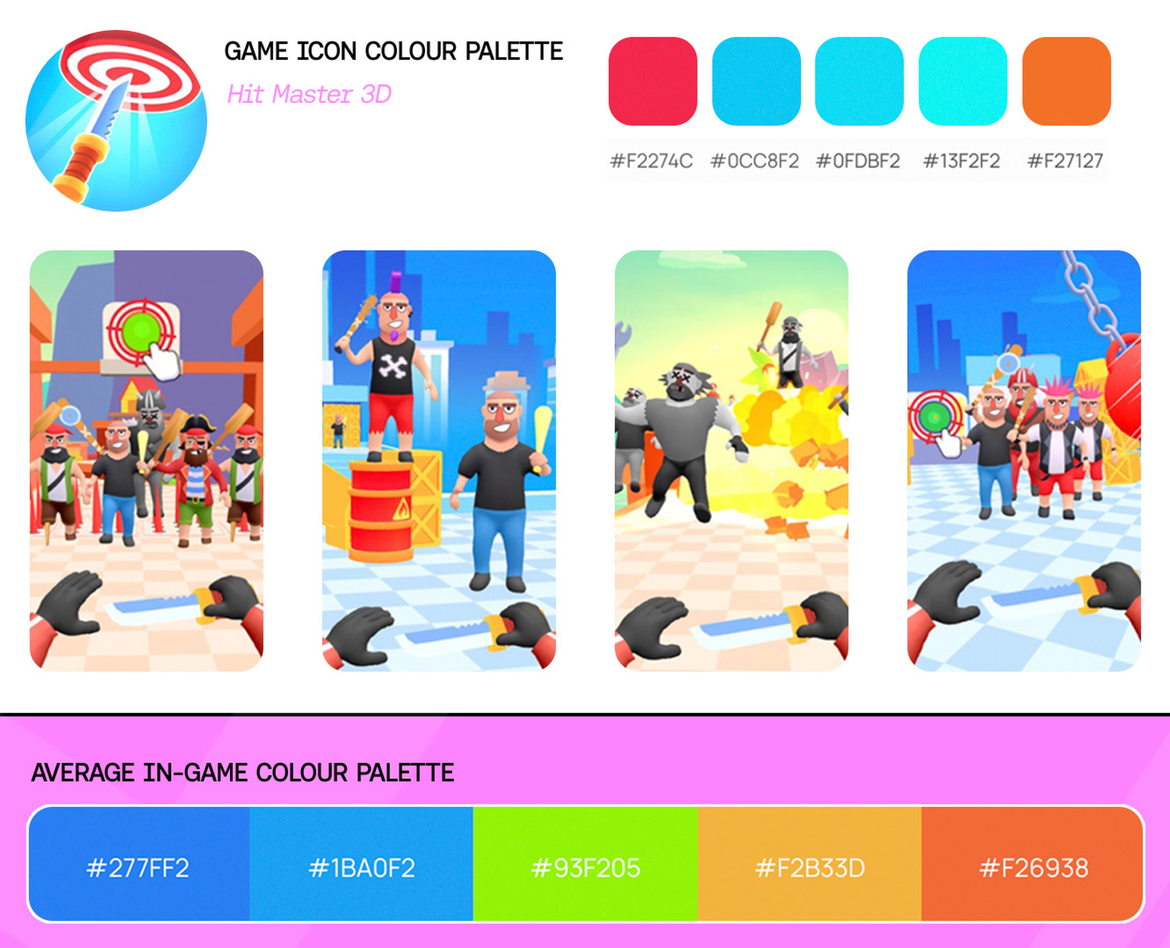
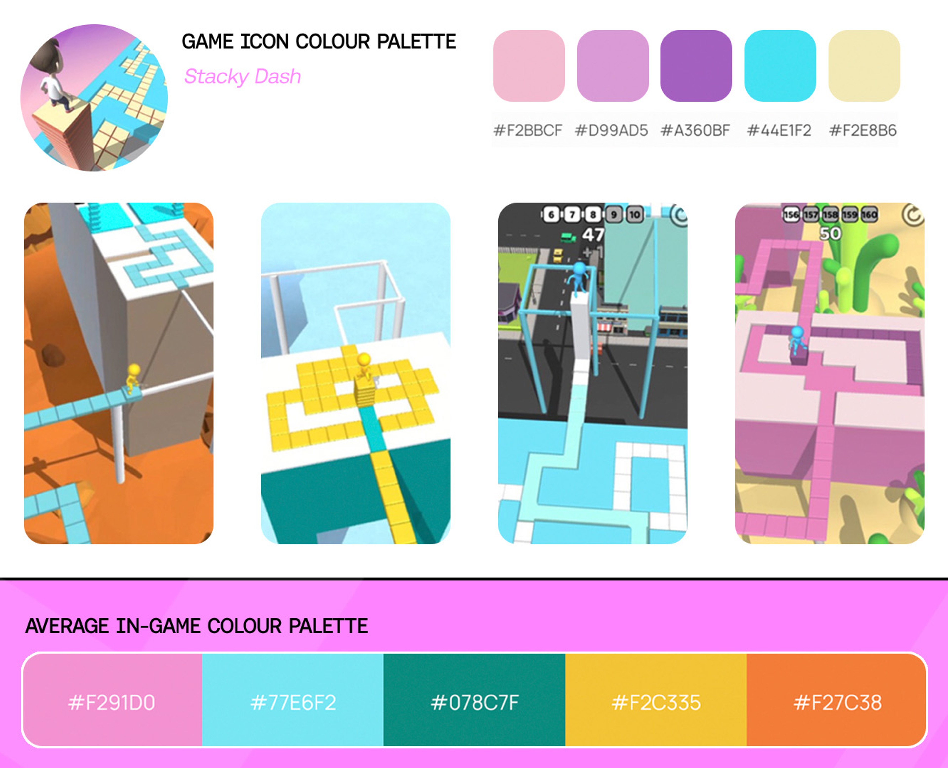
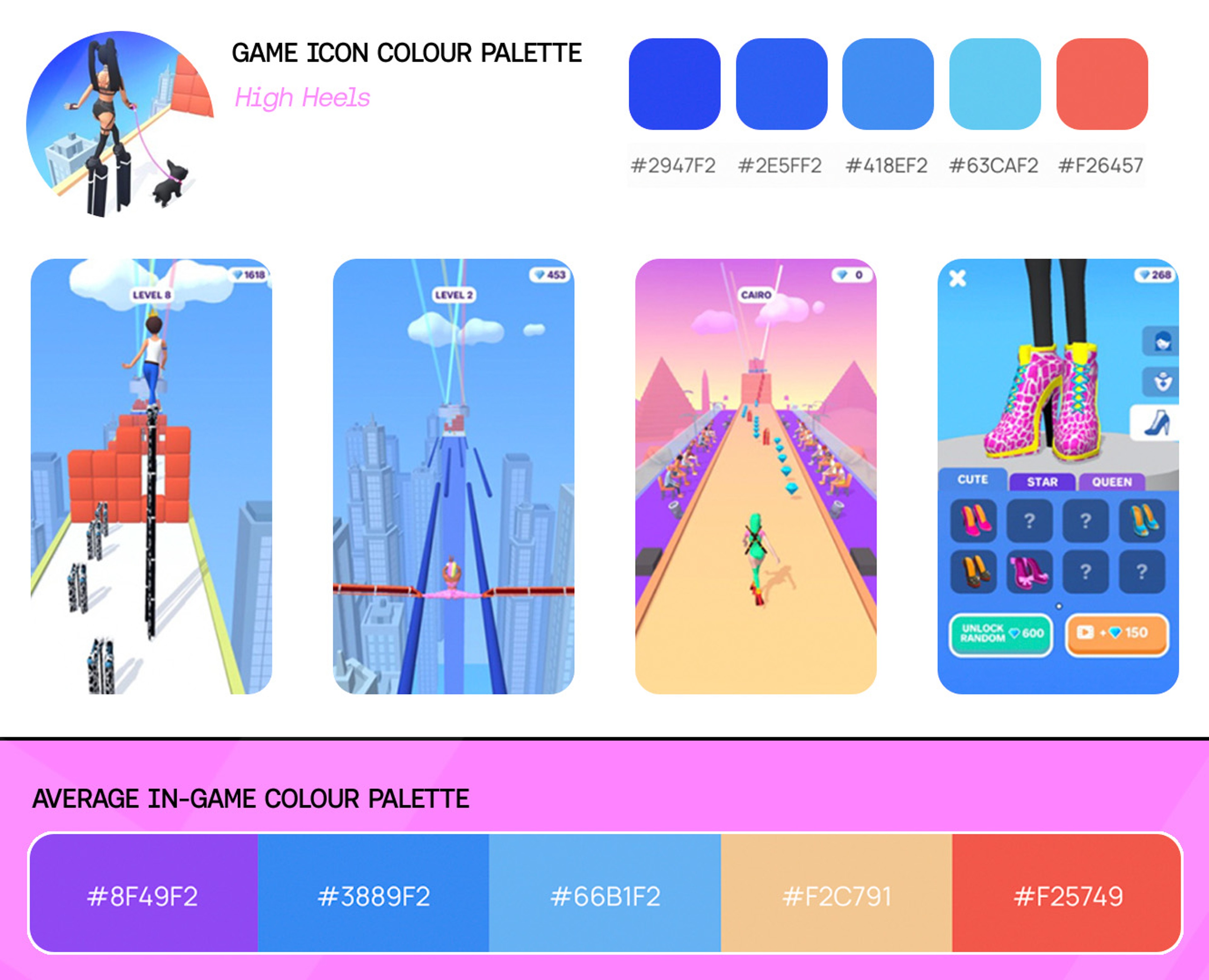
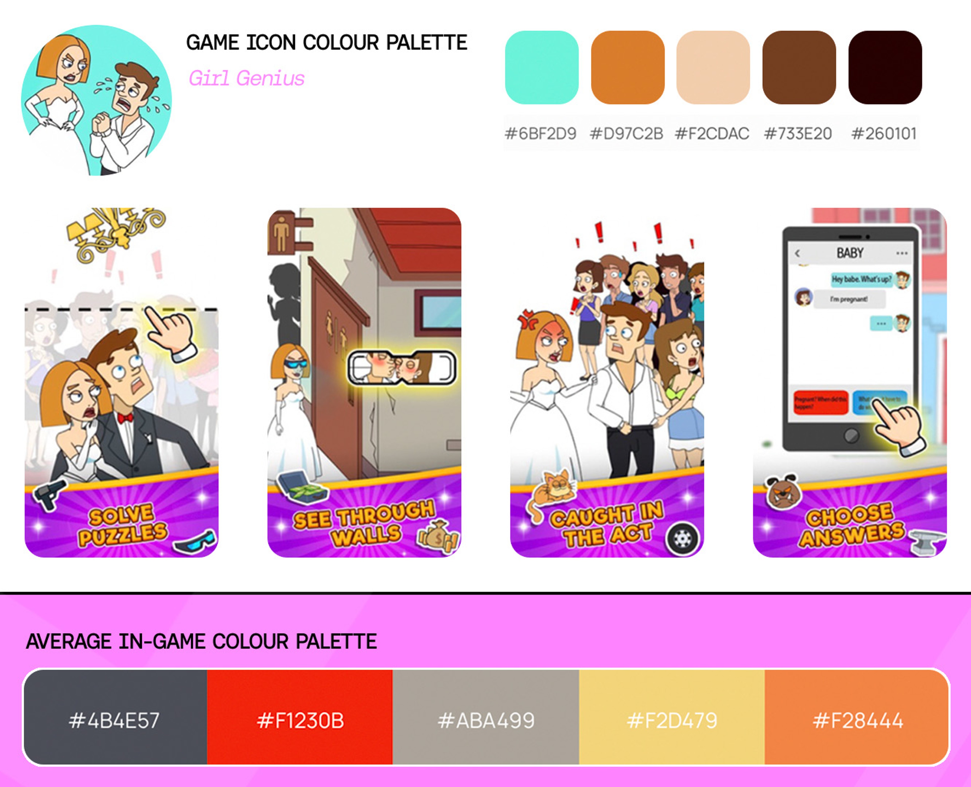
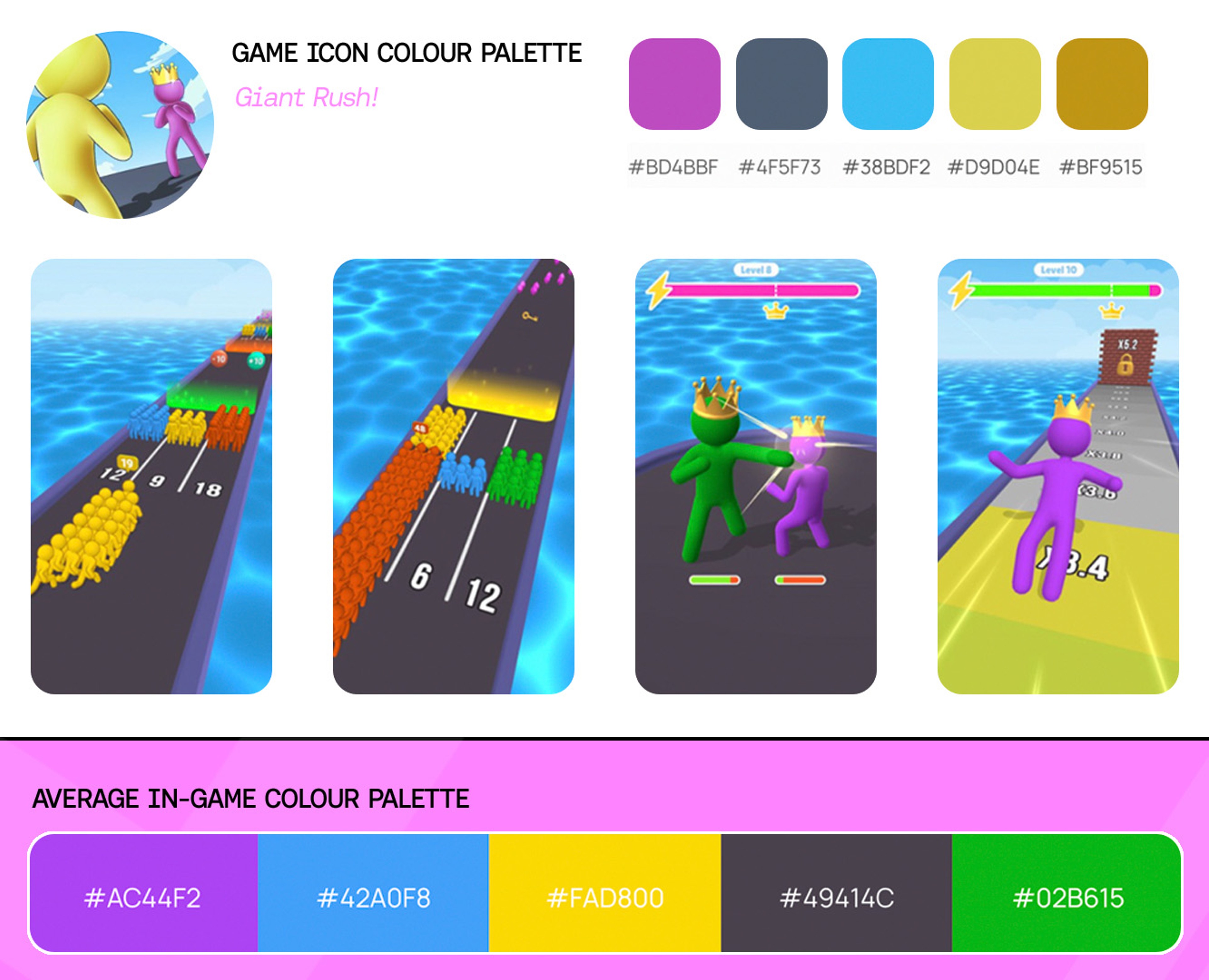
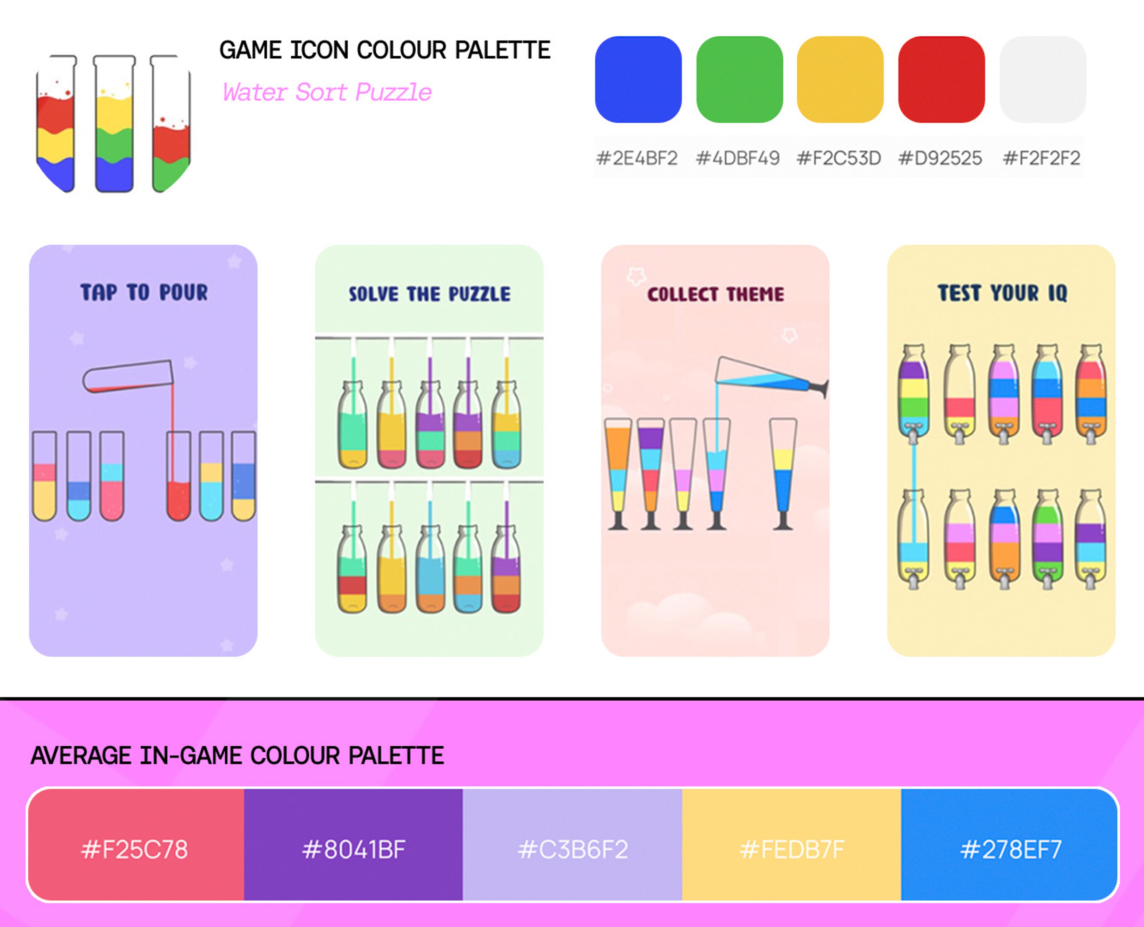
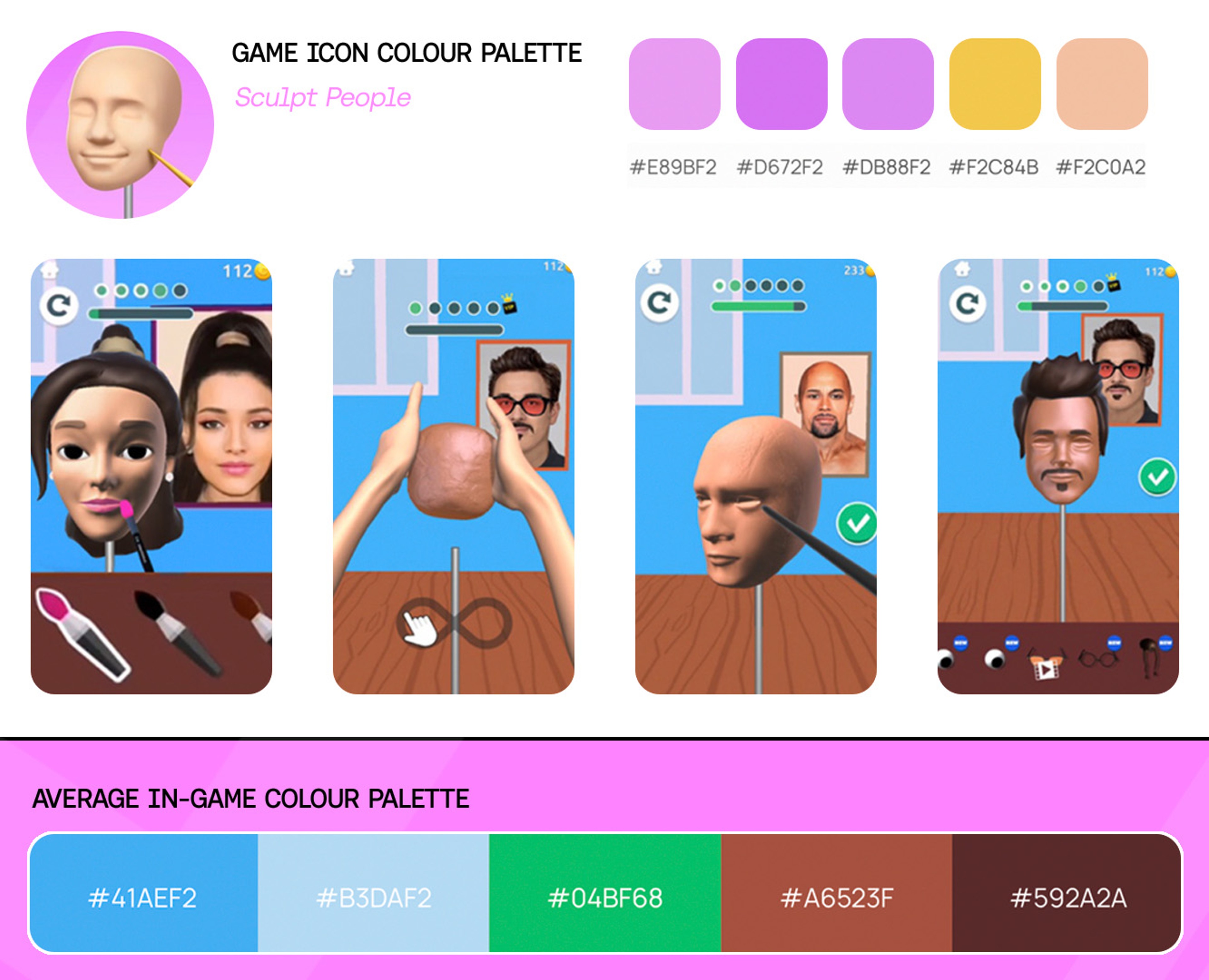
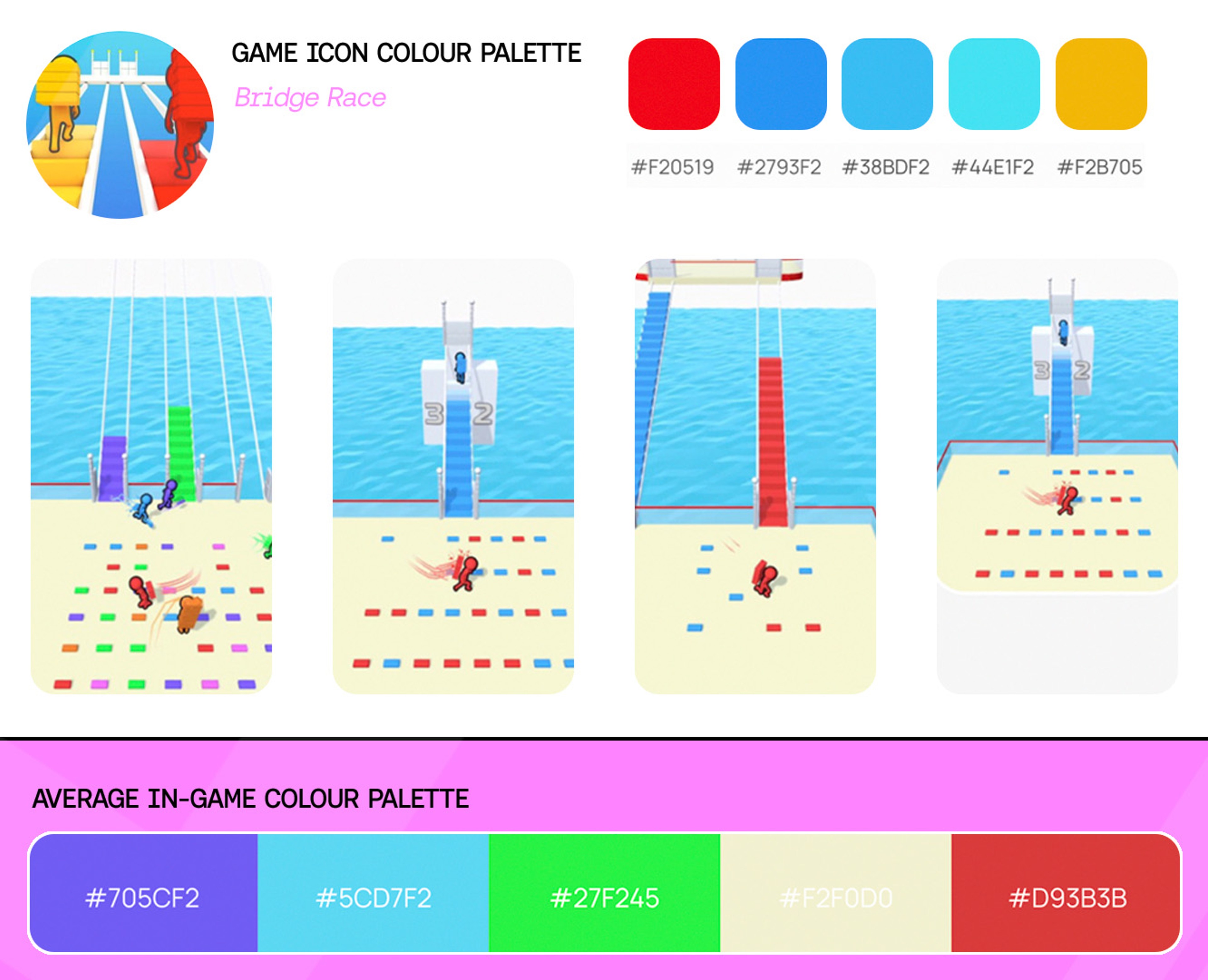
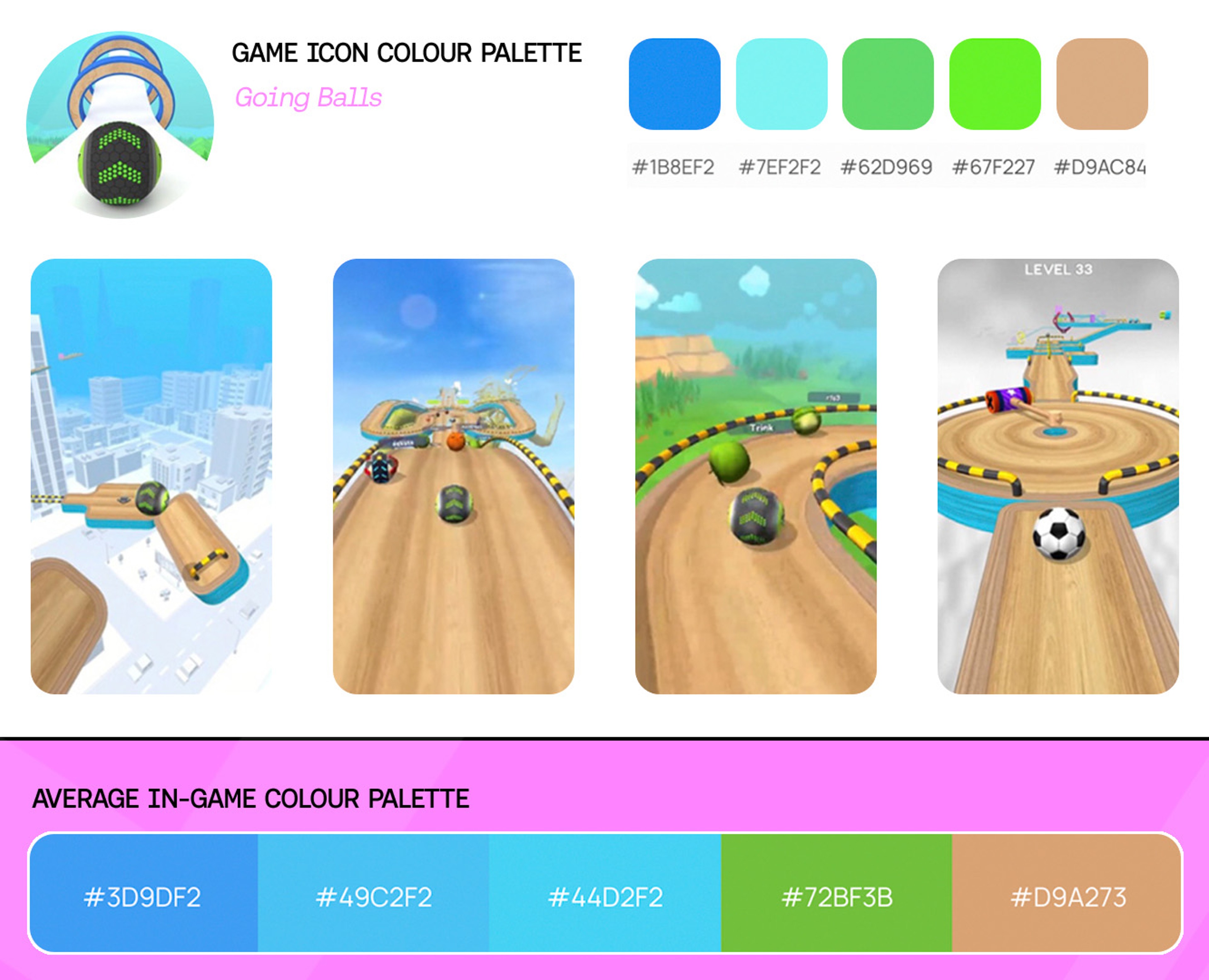
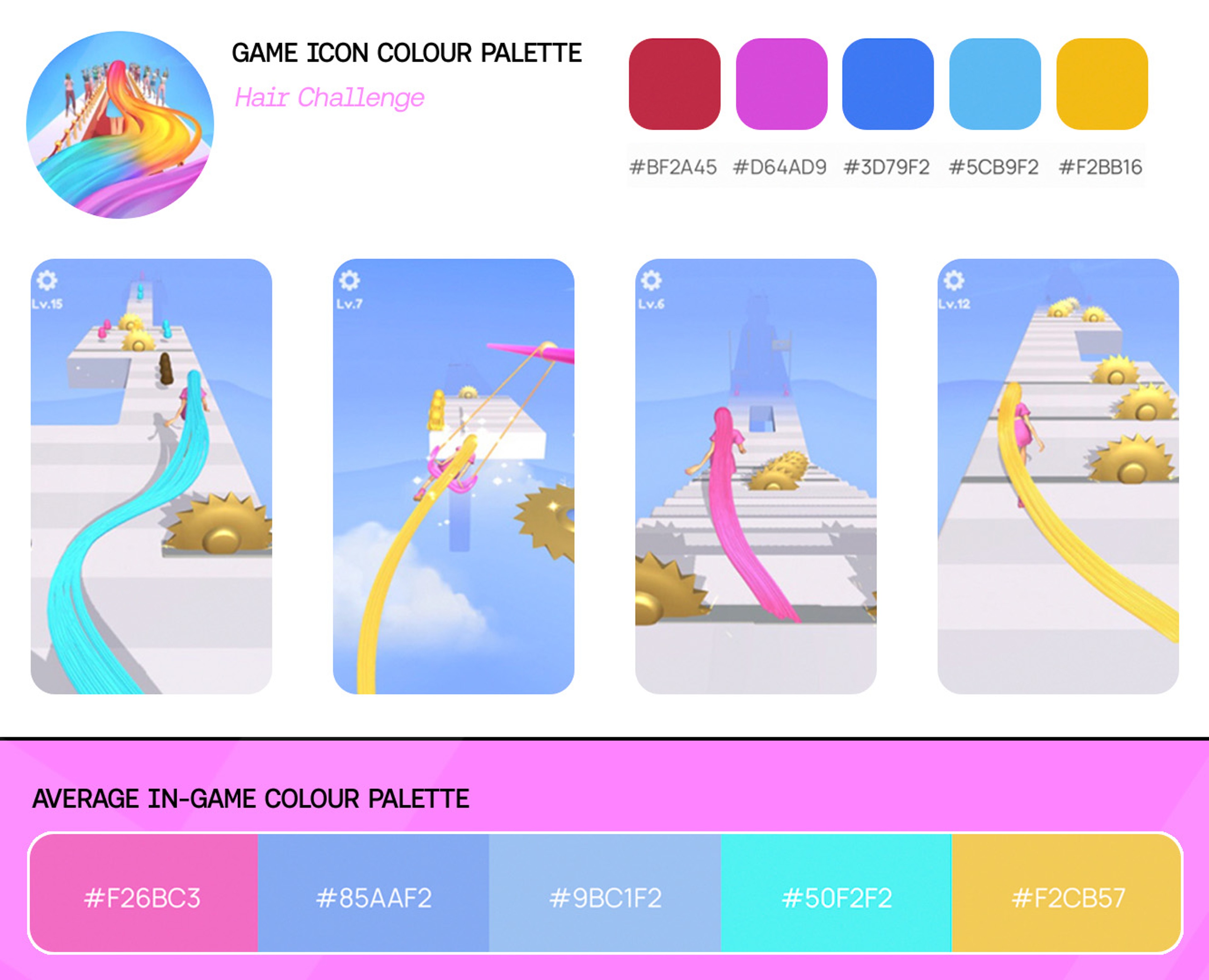
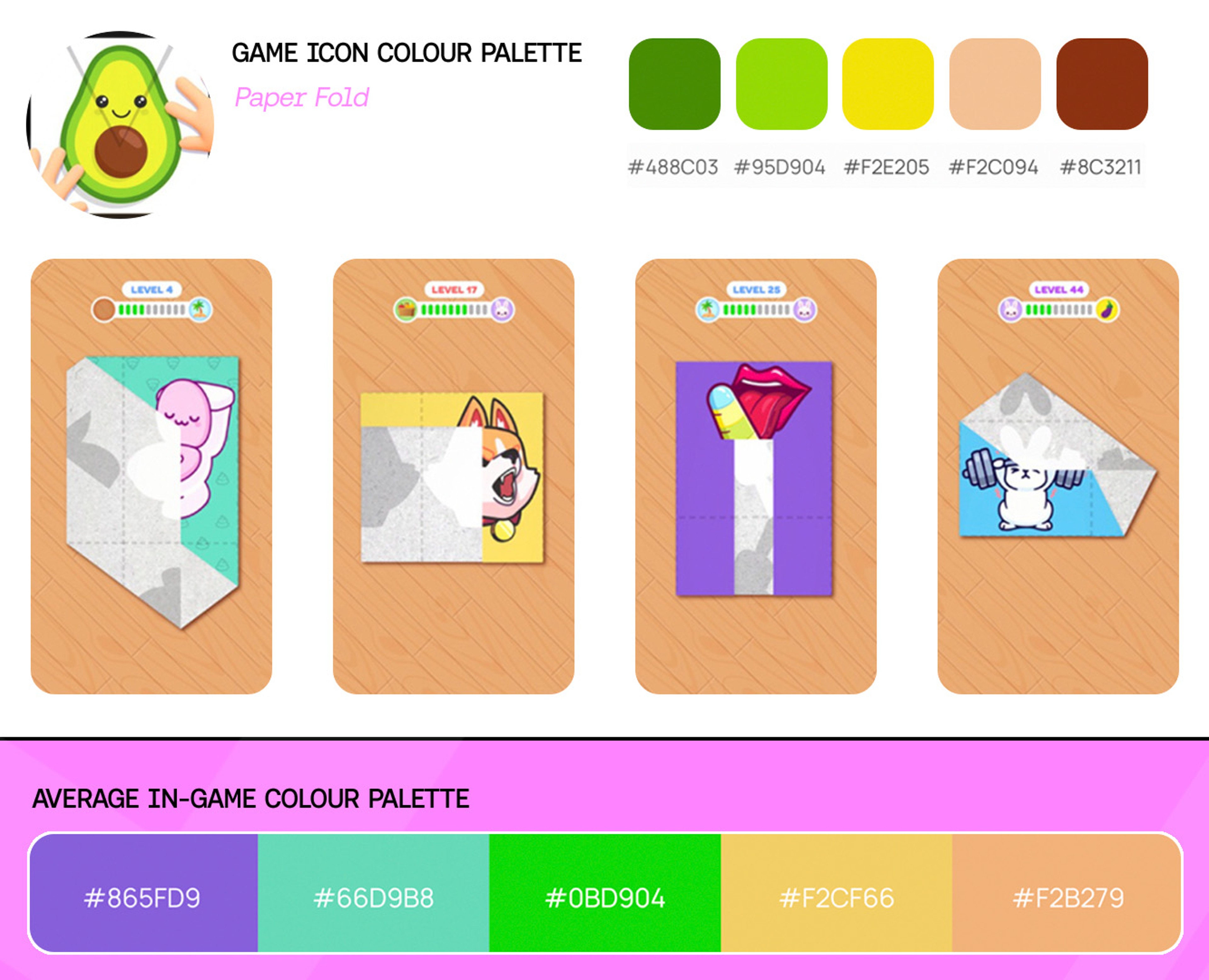
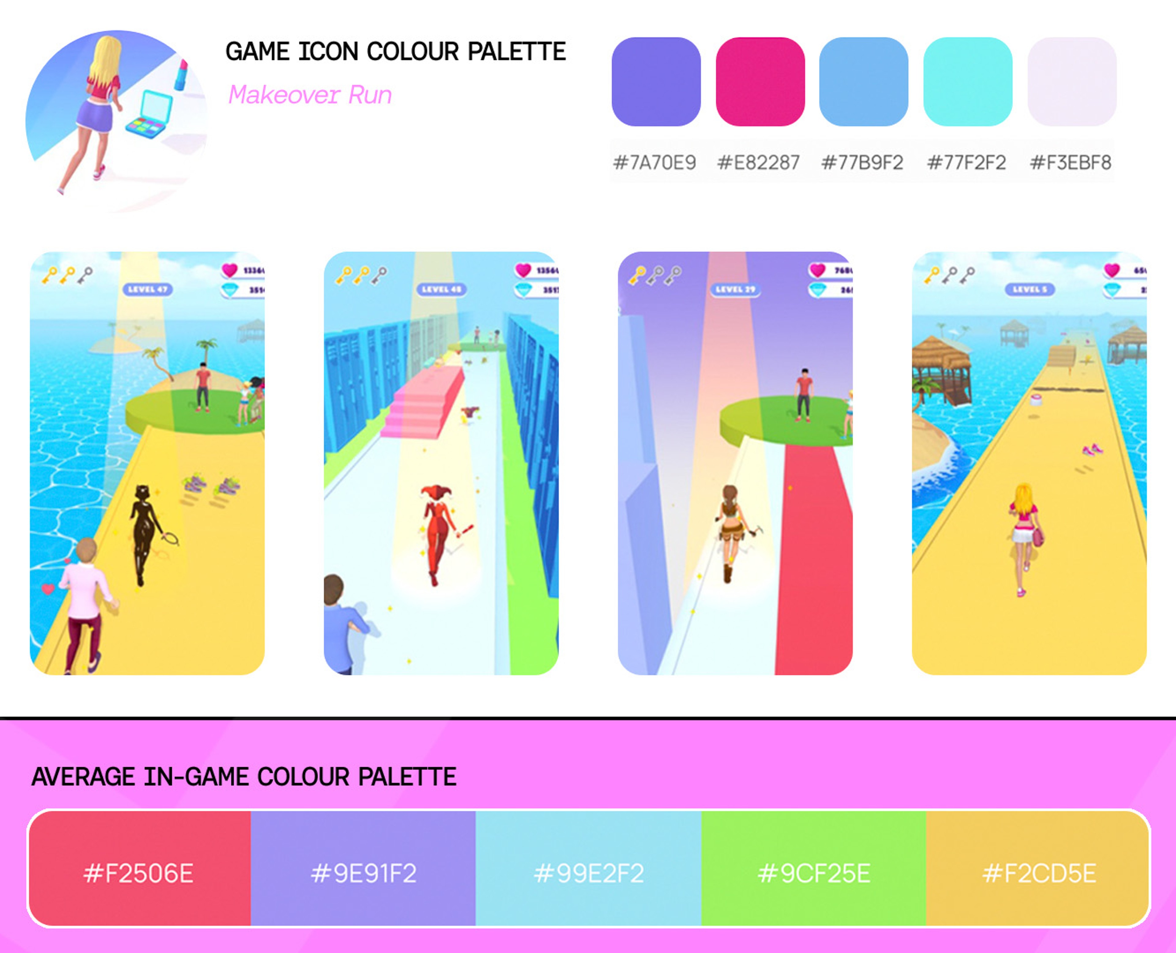
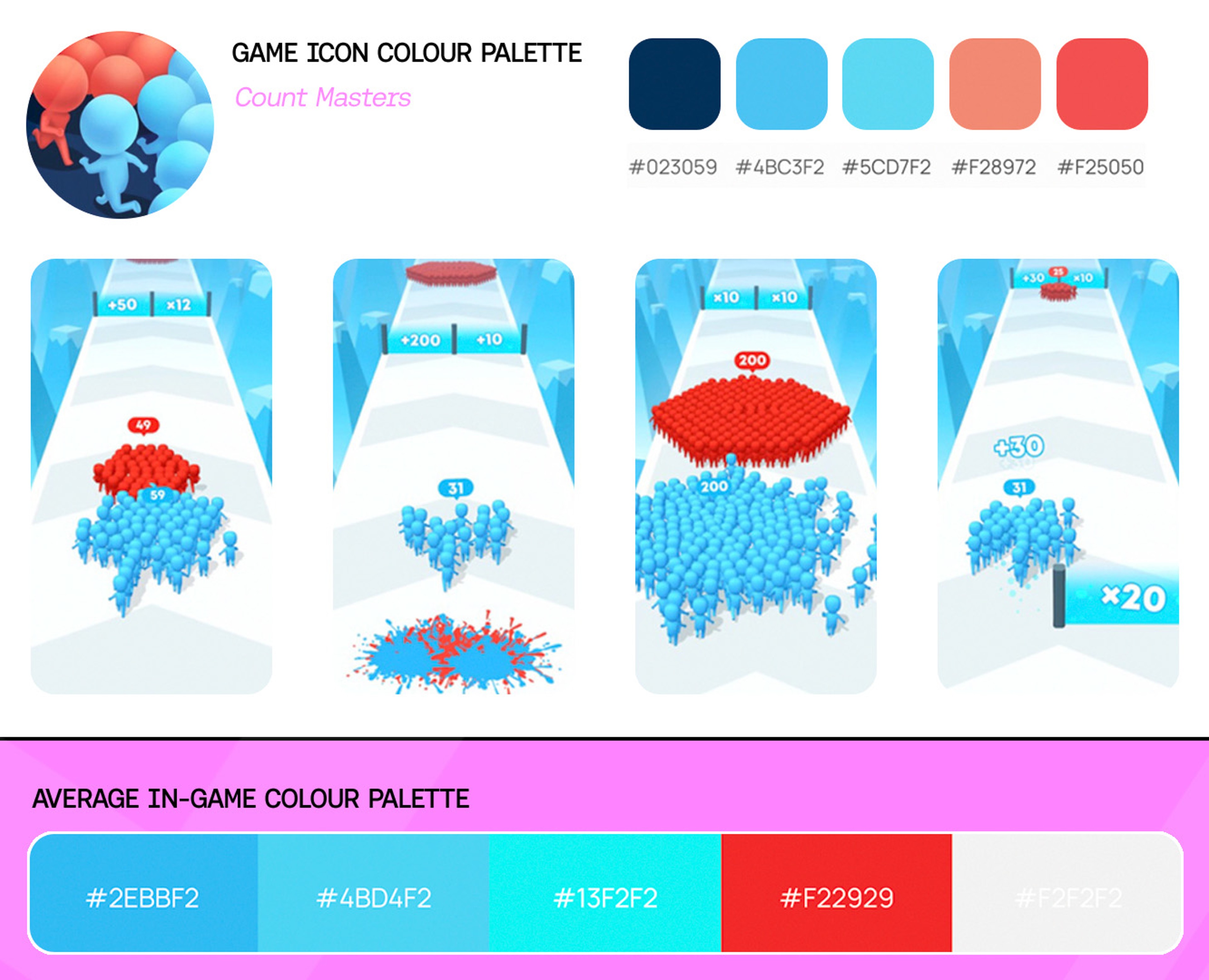
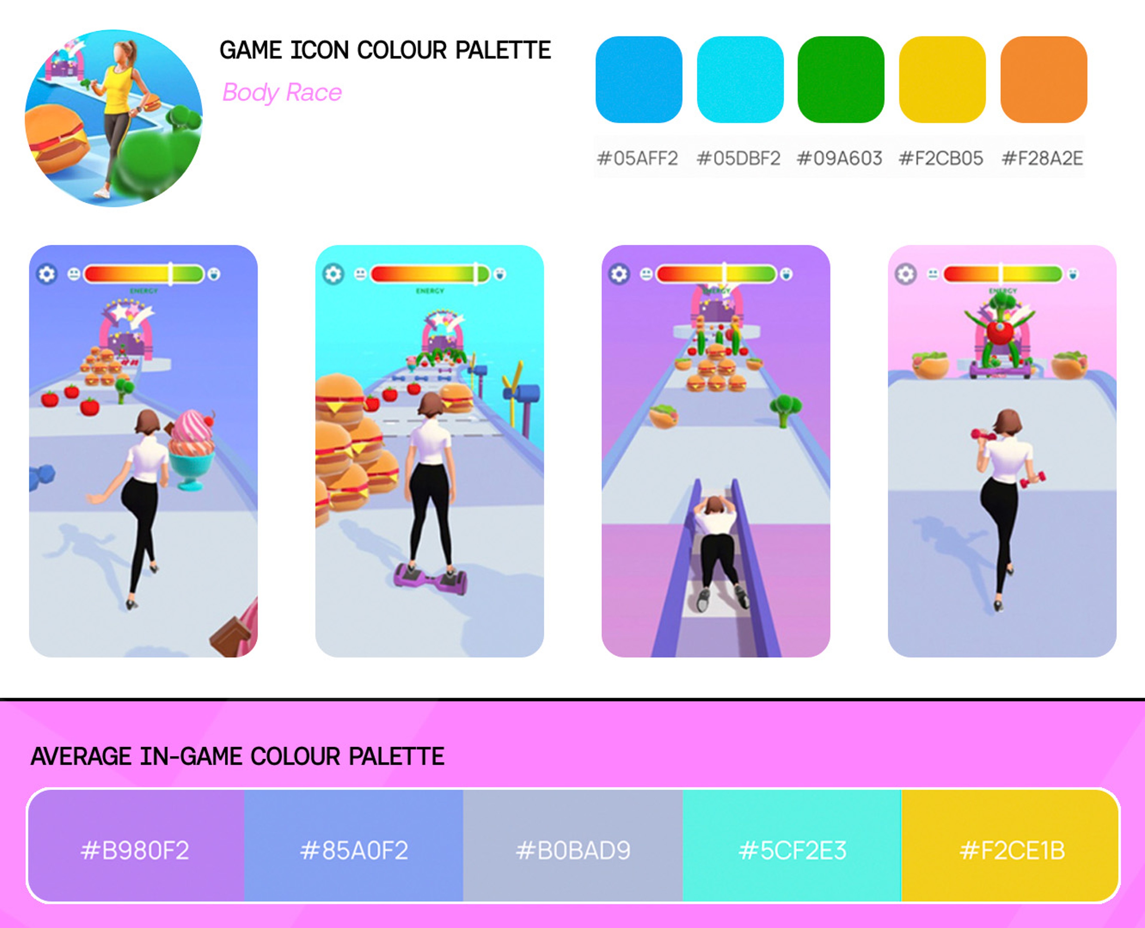
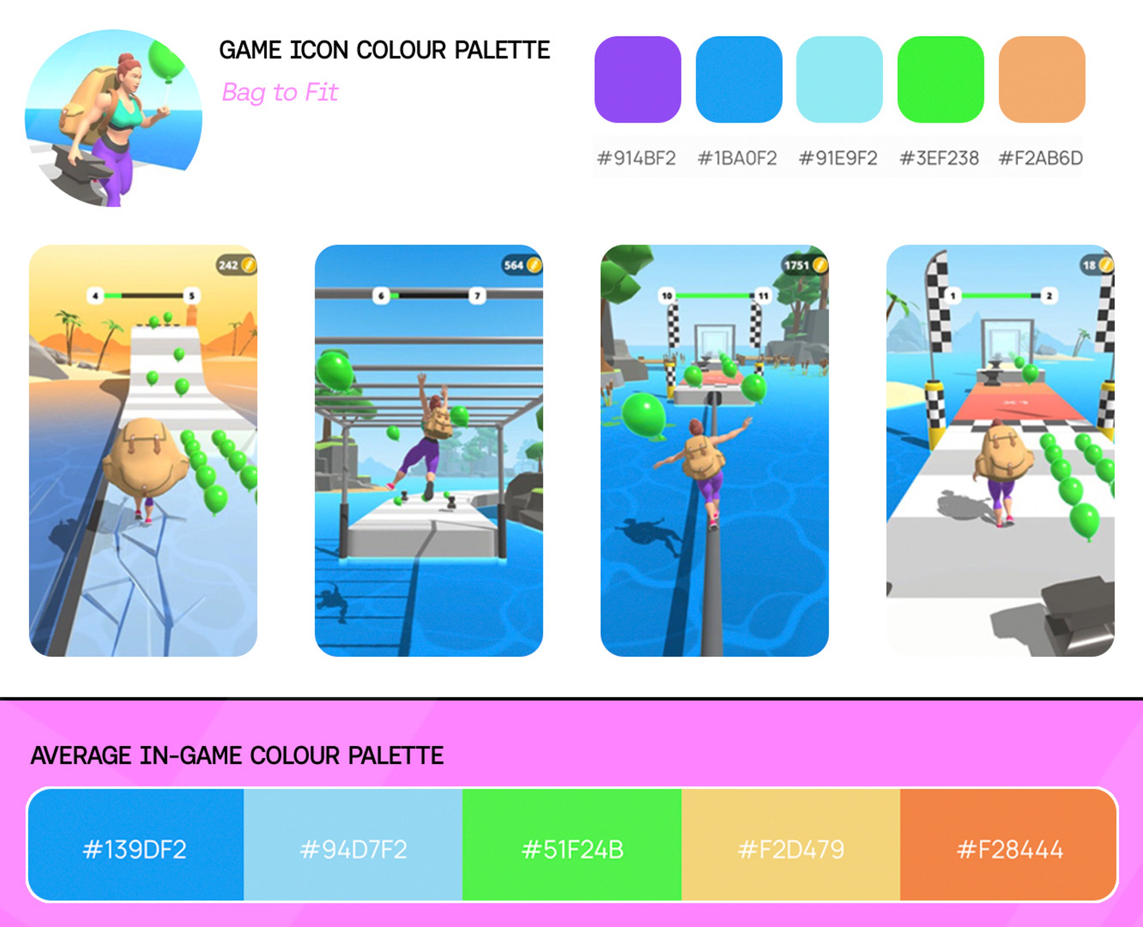
In this post we’ve compiled our top tips for choosing a winning hypercasual game colour palette along with collating all the most successful, most downloaded hyper casual games and icons for the first half of 2021.

So let’s find the perfect colour palette for your hypercasual, hybridcasual or casual game.

What are Colour Palettes in Games?

When we think of colour palettes we all have a pretty good idea what that means. It’s a universal design term that spans across most industries and, whilst there are nuances, in game design it’s a set of predefined colours that are typically linked to game rules.

A palette of 5 colours is most common and, whilst this is by no means set in stone and a guide rather than a rule, it’s a solid place to start. When considering your games colour palette consistency is key.

For example: Green is Good, Red is bad, grey or neutral colours are for platforms etc.

Picking a colour palette for your hypercasual Game

We don’t recommend simply lifting the examples below and using them directly in your game, however, you can certainly use these to understand why they work and as a base to start from.

We won’t be diving into any colour theory in this post, however when choosing your colour palette, it’s important to consider how colours affect your games feel and vibe.

Colours have meanings and emotions associated with them:

  • Red is for danger, energy and passion
  • Orange is for enthusiasm, youth and creativity
  • Green is for harmony, nature and growth
  • Blue is calming, cool and intelligence
  • Purple is for spirituality, mystery and luxury

For a full breakdown we highly recommend checking out this post where they dive deep into colours and their meanings.

Hyper Casual Game Colour Palette Considerations

MISSING ALT TEXT

Before we take a look at some of the best performing hyper casual games and their chosen colour palettes, there’s one important factor for you to consider.

Almost without exception, you’ll need to separate your game action focus from your environment or background.

In the example above we’ve the taken the awesome Z Escape: Zombie Crowd Shooter published here at Homa. The first screenshot ( Blue background ) is the original colour palette.

On the 2nd and 3rd screenshots we’ve altered the background colours to illustrate how the main game action ( player character, baddies and platforms ) remain high contrast and vibrant regardless of the base colour.

You’ll want to keep your backgrounds muted to ensure they don’t distract from the core game loop as their sole purpose is to sell your games universe to the player.

It’s also worth mentioning that around 300 million people in the world have colour vision deficiency, or colour blindness ( around 8% ), so by ensuring a high contrast gameplay focus, this doesn’t impair their experience and keeps your game accessible to all.

In general for hypercasual games, choose a bright, vibrant and clear contrasting colour palette.

Top Hyper Casual Games Colour Palettes

Based on monthly download data compiled from Sensor Tower for Q1 and Q2 of 2021, we’ve handpicked all the Hyper-Casual games that made the Top 10. These are the games most dowloaded aggregated from both the Apple App Store and Google Play store.

Using the Adobe Color Wheel tool, we took a screen grab of all the “product page” screenshots to achieve the overall colour palette based on the publishers marketing assets.

Of course, often there are different colours depending on the level you’re playing but we feel this is an accurate assumption based on these collated screenshots along with our knowledge of the games.

We’ve also recorded the colour palette of the games icon's too to give you. a complete picture of the app store asset suite.

MISSING ALT TEXT
MISSING ALT TEXT
MISSING ALT TEXT
MISSING ALT TEXT
MISSING ALT TEXT
MISSING ALT TEXT
MISSING ALT TEXT
MISSING ALT TEXT
MISSING ALT TEXT
MISSING ALT TEXT
MISSING ALT TEXT
MISSING ALT TEXT
MISSING ALT TEXT
MISSING ALT TEXT
MISSING ALT TEXT
MISSING ALT TEXT
MISSING ALT TEXT
MISSING ALT TEXT
MISSING ALT TEXT
MISSING ALT TEXT
MISSING ALT TEXT
MISSING ALT TEXT

Hyper Casual Game Icon Colour Palettes

We’ve gone ahead and mapped the icon and screenshot hex values onto colour wheels. Whilst this is not a true reflection of the exact tones, hues, luminosity and vibrance, it’s an accurate way for a general overview.

MISSING ALT TEXT

It’s clear that blue and orange hue’s are most common for both icon and in-game palette choices.

These are complimentary colours and are used heavily in film production. If you keep a look out for this palette in the next movie you watch you’ll begin to notice it absolutely everywhere and it’ll be hard to unsee!

Look at out for the classic combo of orange and teal and you'll be surprised just how many film makers use this technique when lighting their scenes.

It makes perfect sense as there’s a strong correlation between icon and game.

Typically your games icon should be a true reflection of your games content but this is something you should be constantly testing.

Be sure to check your game icon first by using our very own Game Icon Tester inside the Homa Academy.

Hyper Casual Gameplay Colour Palettes

MISSING ALT TEXT

The Top 15 Colour Palette tools and generators for Game Design

There’s plenty of online colour palette tools out there for creating your own or downloading pre-made sets. It really comes down to which works best for you and most importantly, selecting the appropriate mood and tone you’re going for.

Here’s our favourite list of colour palette generators and tools to use in you games artwork.

Colour Lovers
Adobe Colour Wheel
Coolors
Colrd
Paletton
Colorsupplyyy
Colorhunt
Colormind
iColor Palette
Brand Colors
Color Designer
Canva Color Palette
Khroma
Mycolor Space
Learn Design Color Picker

Wrapping up Hyper Casual Game Colour Palettes

If you’re feeling stuck and your games colours are just not feeling right, take inspiration from our examples that have had millions and millions of downloads.

By using the online palette pickers and websites, these can be an excellent starting point and a huge source of inspiration.

Just remember, when thinking about your games colour palette, adopting the rule of “opposites attract” can be a great place to start and ensure the colours feel “right” for the game you’re creating.

Look at the colour wheels and see how the blue and oranges live on the opposite sides and above all, don’t be afraid to try different combinations.

Join us inside the Homa Academy!


If you're a mobile game developer interested in Hypercasual, Arcade Idle and Hybridcasual games and would like to take your game building to a whole new level, then join us inside the Homa Academy.

Inside you'll discover our extensive library of training videos, resources and market insights to turbo charge your game development.

Don't forget to head on over to the Homa Academy Community Discord Server for all the latest games to hit the stores, industry insights, game feedback and support for your games.

Character Test
Guessing Game Over

Start building games with data, insight and tested hit potential built right in.